Our Why
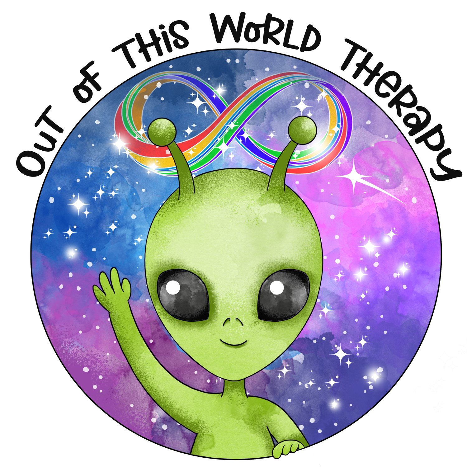
When I envisioned my logo, I kept returning to the concept of outer space. In my work with neurodivergent folks, I have consistently heard the sentiment that we feel like aliens on this earth trying to learn how to properly human.
Therapies like ABA and conversion therapy have been used to teach people how to mask better so that we can be accepted by our peers. For many of us, the consequences of these therapies are trauma, suppression, and a disenfranchised sense of self.
In contrast, the therapy provided in this space is radically neurodivergence-affirming and 2SLGBTQ-affirming. It was important to me to create a space where everyone can reclaim the parts of themselves that make them feel alienated from the rest of the world. A place where you fit in even if you stand out.
The rainbow infinity sign is one of the most accepted symbols for neurodiversity and it is featured near the top of the logo as part of the background. As someone who is fascinated by the universe and galaxies, I sought to integrate my own special interests, connection to spirituality, and favourite colours into my logo. This represents how I show up as a therapist, often engaging in mutual vulnerability and sharing relevant parts of myself with clients, when appropriate.
The name Out of this World Therapy was chosen to emphasize the theme of feeling alienated from others — for our neurotype, sexual orientation, gender identity and expression, and other aspects of our identity — while also representing our ability to meet you where you’re at in your personal journey. This name also represents the way we do therapy, often combining evidence-based psychotherapy and counselling modalities with creative, non-traditional methods that are engaging for all neurotypes.

